Andrey Ozerov · Design systems for multi-brand products
Many brands. One codebase.
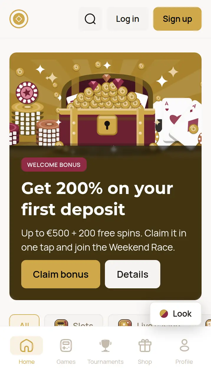
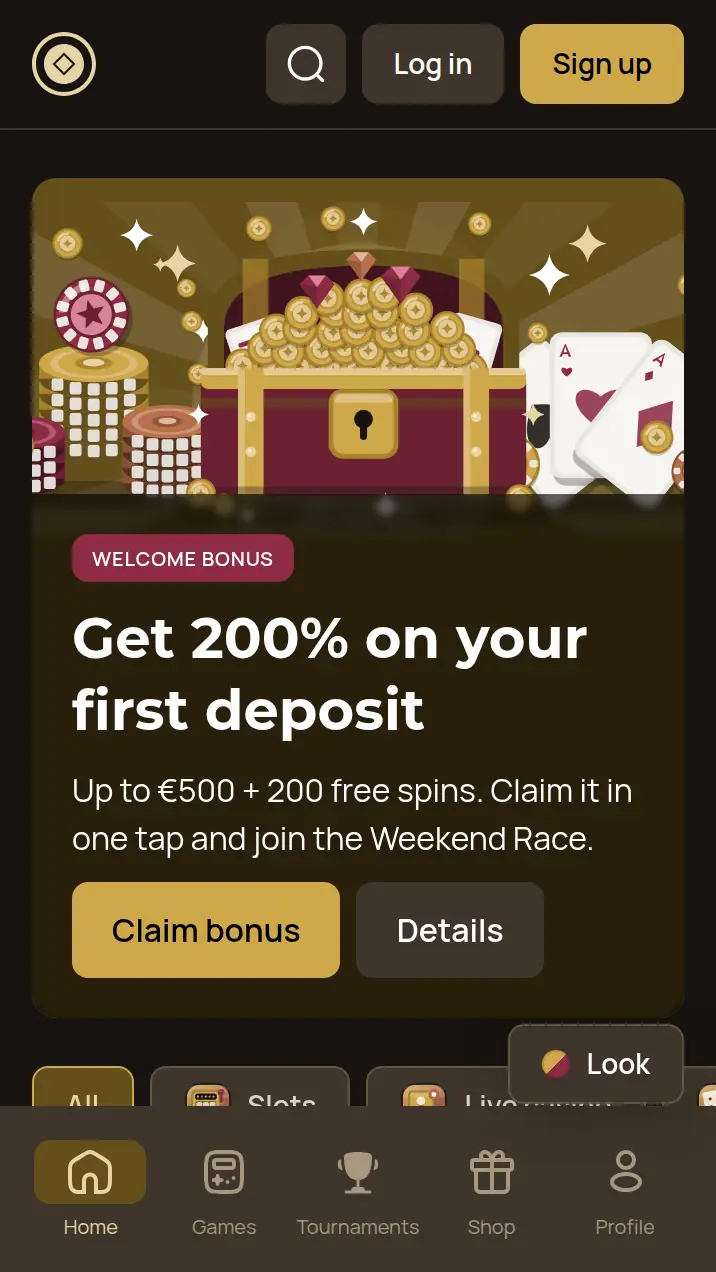
I build token architectures where a new brand is one file of 55 values. Components, markup and releases stay exactly the same. The proof is below: a live product in 4 brands and 2 themes.
Key numbers
- 4brands in the live demo, all on one codebase
- 2themes per brand: light and dark
- 55values in a brand file. That file is the whole brand
Switch the brand. The code stays put.
Loading demo…
Six layers. Only one of them is the brand.
A component never knows which brand it is in. It asks for a meaning, the theme picks a step on a color ramp, and only the brand file holds real colors, fonts and radii. Every number below is counted from the demo's tokens at build time.
The layers, top to bottom
- Components548 tokens · 29 components
Buttons, cards and chips read meanings, never raw values.
- Theme73 per theme × 2
Semantic colors: text, fill, border. Light and dark are an axis of their own.
- Typography25 text styles
Built from the brand's fonts and the core type scale.
- Map41 ramp steps
Tints and shades calculated from brand colors, so nobody picks them by hand.
- BrandPer brand55 values × 4 brands
The only file that changes when you add a brand.
- Core59 values
The raw scale: sizes, radii, weights, base colors.
Follow one token through the layers
- Component
button.primary.bg.default - Theme
color.fill.primary.default - Map
color.product1.500step 500 is the brand color itself - Brand
color.product1#CFA74A - Result#CFA74A
- Component
button.primary.bg.default - Theme
color.fill.primary.default - Map
color.product1.500step 500 is the brand color itself - Brand
color.product1#CFA74A - Result#CFA74A
- Component
button.primary.bg.default - Theme
color.fill.primary.default - Map
color.product1.500step 500 is the brand color itself - Brand
color.product1#22D3EE - Result#22D3EE
- Component
button.primary.bg.default - Theme
color.fill.primary.default - Map
color.product1.500step 500 is the brand color itself - Brand
color.product1#22D3EE - Result#22D3EE
- Component
button.primary.bg.default - Theme
color.fill.primary.default - Map
color.product1.500step 500 is the brand color itself - Brand
color.product1#FFC93C - Result#FFC93C
- Component
button.primary.bg.default - Theme
color.fill.primary.default - Map
color.product1.500step 500 is the brand color itself - Brand
color.product1#FFC93C - Result#FFC93C
- Component
button.primary.bg.default - Theme
color.fill.primary.default - Map
color.product1.500step 500 is the brand color itself - Brand
color.product1#FF3D9E - Result#FF3D9E
- Component
button.primary.bg.default - Theme
color.fill.primary.default - Map
color.product1.500step 500 is the brand color itself - Brand
color.product1#FF3D9E - Result#FF3D9E
- Component
chip.selected.bg.default - Theme
color.fill.primary.subtle - Map
color.product1.10085% lighter than the brand color - Brand
color.product1#CFA74A - Result#F8F2E4
- Component
chip.selected.bg.default - Theme
color.fill.primary.subtle - Map
color.product1.90055% darker than the brand color - Brand
color.product1#CFA74A - Result#644E1B
- Component
chip.selected.bg.default - Theme
color.fill.primary.subtle - Map
color.product1.10085% lighter than the brand color - Brand
color.product1#22D3EE - Result#DEF8FC
- Component
chip.selected.bg.default - Theme
color.fill.primary.subtle - Map
color.product1.90055% darker than the brand color - Brand
color.product1#22D3EE - Result#096472
- Component
chip.selected.bg.default - Theme
color.fill.primary.subtle - Map
color.product1.10085% lighter than the brand color - Brand
color.product1#FFC93C - Result#FFF7E2
- Component
chip.selected.bg.default - Theme
color.fill.primary.subtle - Map
color.product1.90055% darker than the brand color - Brand
color.product1#FFC93C - Result#8E6600
- Component
chip.selected.bg.default - Theme
color.fill.primary.subtle - Map
color.product1.10085% lighter than the brand color - Brand
color.product1#FF3D9E - Result#FFE2F0
- Component
chip.selected.bg.default - Theme
color.fill.primary.subtle - Map
color.product1.90055% darker than the brand color - Brand
color.product1#FF3D9E - Result#8E0047
- Component
button.borderRadius - Brand
borderRadius.control - Core
borderRadius.88px - Result8px
- Component
button.borderRadius - Brand
borderRadius.control - Core
borderRadius.88px - Result8px
- Component
button.borderRadius - Brand
borderRadius.control - Core
borderRadius.00px - Result0px
- Component
button.borderRadius - Brand
borderRadius.control - Core
borderRadius.00px - Result0px
- Component
button.borderRadius - Brand
borderRadius.control - Core
borderRadius.999999px - Result999px
- Component
button.borderRadius - Brand
borderRadius.control - Core
borderRadius.999999px - Result999px
- Component
button.borderRadius - Brand
borderRadius.control - Core
borderRadius.1212px - Result12px
- Component
button.borderRadius - Brand
borderRadius.control - Core
borderRadius.1212px - Result12px
Switch the site theme at the top right: light and dark take different steps of the same ramp.
How a brand gets from Figma to production
A brand is data
Every brand is one Token Studio file with the same 55 keys: colors, fonts, radii, spacing, layout. Designers change values. Component tokens are never touched.
The pipeline builds it
Tokens live in Git as JSON and compile to CSS custom properties. Automated checks catch missing keys, broken layer references and failing WCAG contrast before anything ships.
Two attributes switch it
The product changes brand and theme with data-brand and data-theme on one element. Same markup, same components, one release for every brand.
For teams running more than one brand
iGaming and white-label platforms
One product sold under many brands. Every operator gets its own look without a separate codebase.
Fintech with sub-brands
A main brand plus products for different audiences or markets. Same UX, different look, one library.
Agencies on one stack
Many clients on the same components. A new client starts from a brand file, not from a fork.
Running more than one brand? Let's talk.
An audit of your current system, a token architecture, a full multi-brand library or just the Figma-to-code pipeline. Tell me where you are now.